The Color Art Of Packaging Cartons
Paper materials are abundant and light, easy to process, transport, carry and decorate and print, easy to meet hygiene requirements, non-toxic and pollution-free, low cost, and widely used in packaging. According to relevant statistics, paper materials in sales packaging account for about 45% of the total packaging materials. They are not only used for packaging of department stores, textiles, hardware, telecommunications equipment, household appliances and other commodities, but also for packaging of food, medicine and military products.
Paper boxes are widely used and consumed packaging containers in paper packaging containers. There are two major categories: pasted paper boxes and folding paper boxes. The former is mostly used for higher-grade packaging and has a higher cost; the latter is the most widely used category because it is suitable for mass production and processing. Color is one of the important factors in packaging and decoration design. It is expressed by graphics, text, and texture, and plays a vital role in packaging and decoration design. When people browse the goods on the shelves, the first thing that catches their eyes is the color of the packaging. Color is not only related to the display effect of the goods, but also directly affects the consumer’s desire to buy. This article discusses the color art of packaging paper boxes.
Customary colors of packaging cartons
Colors will have a strong psychological response on consumers, making them have corresponding associations. This should be fully considered when using colors. The following is an explanation of the customary colors of common packaging cartons.
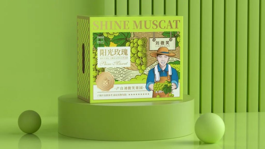
① Food cartons: Bright and light colors are often used. For example, blue and white are used to represent cleanliness, hygiene, coolness, etc.; red, orange, and yellow represent sweetness, fragrance, and freshness; simple and solemn complex colors represent the mellowness and long history of fine wine, etc. They are all very helpful in promoting appetite.
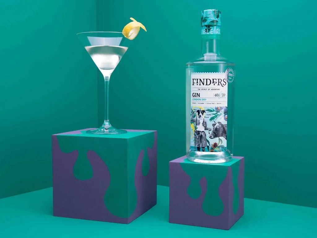
② Cosmetic cartons: Soft intermediate colors are often used. For example, pink, pink, and light rose red are used to represent fragrance, softness, and nobility; black is sometimes used for some men’s cosmetics to represent their solemnity, etc.
③ Children’s product cartons: Bright and eye-catching pure colors or colors with strong contrast are often used to represent vividness and liveliness, etc.
④ Pharmaceutical cartons: Simple warm and cold colors are often used. For example, green and cool gray are used to indicate tranquility, anti-inflammatory, and analgesia; warm colors such as red, orange, and yellow indicate nourishment, nutrition, excitement, etc.; black indicates poison; red and black blocks indicate highly toxic, etc.
⑤ Textile paper boxes: black, white, and gray are often used in a hierarchical relationship, and contrast is sought in harmony; women’s textiles are mostly bright and elegant colors.
Packaging colors are based on people’s associations and habits of colors, and are highly exaggerated and changed to seek novelty and difference. The psychological effects of colors are complex, and often vary with different countries, regions, nationalities, religious beliefs, etc.
Emotional expressions of different colors
Color is the result of the visual effects of light of different wavelengths, and there is no “emotion” in it. However, the environment we live in is constantly leaving a deep impression on people through color. A large number of facts have proved that different colors can have different psychological and physiological effects on people, and they vary according to people’s age, gender, experience, nationality, and environment. Therefore, packaging and decoration design should fully consider the abstract expression rules of colors with different feelings, so that colors can better reflect the attributes of the goods, adapt to consumer psychology, and meet the needs of different consumption levels in the target market.
1.The sense of warmth and coldness of colors
Red, orange, and yellow are warm colors, which are easy to associate with the sun, flames, etc., that is, to produce a warm feeling; while cyan and blue are cold colors, which are easy to associate with ice, snow, ocean, springs, etc., that is, to produce a cool feeling. There is also a set of concepts of warmth and coldness, that is, general colors will tend to be cold when white is added, and will tend to be warm when black is added. For example, beverage packaging often uses cold colors, and white wine packaging often uses warm colors. The warmth and coldness of colors are most affected by hue.
2.The sense of lightness and heaviness of colors
The sense of lightness and heaviness of colors is mainly determined by the brightness of colors. Generally, light colors with high brightness and cold hues feel lighter, with white being the lowest; dark colors with low brightness and warm hues feel heavier, with black being the heaviest. With the same brightness, colors with high purity feel lighter, and cold colors appear lighter than warm colors. In decoration design, the lower part of the picture is generally made of low-brightness and low-purity colors to show stability; for children’s product packaging, it is appropriate to use colors with high brightness and purity to give a sense of lightness.
3.Sense of distance of color
Some colors on the same plane make people feel prominent and close, while others make people feel retreated and far away. This sense of advance and retreat in distance mainly depends on brightness and hue. Generally, warm colors are close and cold colors are far away; bright colors are close and dark colors are far away; pure colors are close and gray colors are far away; bright colors are close and blurred colors are far away; colors with strong contrast are close and colors with weak contrast are far away. Bright and clear warm colors are conducive to highlighting the theme: blurred and gray cold colors can set off the theme.
4.Sense of taste of color
In food packaging, color plays an important role in causing the taste of food. When people see red candy packaging, they will feel the sweetness is strong; when they see light yellow used on cakes, they will feel the milky fragrance. Generally speaking, red, yellow and white have sweet taste; green has sour taste; black has bitter taste; white and blue have salty taste; yellow and beige have milky flavor, etc. Foods with different flavors can be packaged in corresponding colors to arouse consumers’ desire to buy and achieve good results.
5.Luxurious and simple sense of color
Bright colors with higher purity and brightness, such as red, orange and yellow, have a strong sense of magnificence, while dark colors with lower purity and brightness, such as blue and green, appear simple and elegant. The former can be used for gift and handicraft packaging; the latter can be used for pharmaceuticals. At the same time, the amount of hue also plays a certain role. More hue appears gorgeous, and less hue appears simple.
The above emotional effect of color can make the packaging carton more attractive, make the typical characteristics of the product more prominent, and expand and promote commodity sales.
Color design of carton packaging decoration
The color design of carton packaging decoration is attached to graphics, text and texture. It not only requires beauty and generosity to meet people’s aesthetic requirements, but also should be highly coordinated with people’s psychological feelings. Color design is mainly considered from the following aspects:
1.Color tone
Tone is the general tendency and mood of the color configuration on the screen. It is the main color of a group of colors and has an absolute advantage in the whole picture. The packaging requires to stand out from the visual perspective of a moment on a distant shelf to convey product information, which requires a tone with a strong sense of overallness to match. Therefore, the key to packaging color design is tone design.
Tone design requires unity with the main function of the product, such as red and orange tones are suitable for gift packaging, and cold tones are suitable for cold drink packaging.
Tone design requires unity with the times, and the likes and dislikes of colors in different regions and different ethnic groups. It must be able to adapt to such changes and follow the trend of the times. For example, people in the Islamic region like green and avoid yellow; Tibetans regard white as a noble color and avoid light yellow and green; Manchus like yellow, purple, red, and blue and avoid white. Tone design should fully consider these traditional habits to make the product popular. For export goods, packaging design can only respect the customs of other countries or ethnic groups.
2.Color contrast
On the 12-color wheel, two colors that are opposite to each other are called contrasting colors. Their hue and brightness are the most different, leaving people with a vivid and strong contrast feeling. Colors can only express images correctly through contrast. Contrast mainly includes the following three aspects:
Brightness contrast
Including brightness contrast of the same hue and different hues, it is necessary to compare repeatedly to accurately express. Brightness contrast can enhance the sense of brightness. The stronger the contrast, the clearer the visual effect, and vice versa.
Purity contrast
In the same hue, the higher the purity, the brighter it is, and the lower the purity, the more turbid it is. Purity contrast can enhance the sense of richness.
Hue contrast
This is a color shift phenomenon caused by different hues when two or more colors are juxtaposed or alternately changed. It can be divided into adjacent color contrast, complementary color contrast and cold and warm contrast.
When designing color contrast, the contrast should be just right to make the picture bright but not vulgar, gorgeous but not superficial, and produce a harmonious and harmonious beauty.
3.Harmony of colors
On the 12-color wheel, two similar colors are called harmonious colors. Harmony of colors gives people a sense of implicitness, richness, elegance, pleasure and comfort. The main harmonization methods are:
Harmony of similar colors
It refers to the combination of colors with the same color but different brightness, such as the combination of light green, bright green and dark green or the combination of light red, bright red and dark red.
Harmony of similar colors
It refers to the combination of different colors with common components, such as orange, vermilion and yellow all contain yellow components, which are easy to coordinate when combined together.
4.Rhythm of colors
Rhythm is an important factor in the sense of form of the picture. There are many changes in the picture, such as strength, size, light and dark, hard and soft, high and low, virtual and real, etc. The alternation of these contradictory sides is not a simple repetition, but a rhythmic movement in various forms. It has both repetition and development. All aspects restrict and promote each other, reflecting the harmony of nature. From the perspective of the picture effect, there are fierce, stable, happy, melancholy, etc. Various colors form an organic whole to reflect the same theme and blend into the rhythm.
In the color relationship, contrast is the factor of change, and harmony is the factor of unity. The basic requirement of packaging color design is to handle the relationship between change and unity, seek change in unity, and seek unity in change. The two complement each other. At the same time, the color effect of packaging is not about using more colors, but the key lies in the selection and coordination of colors. Using too many colors can easily produce a messy feeling and appear tacky.
TALK TO US TODAY ABOUT YOUR CUSTOM PACKAGING NEEDS
For more information please visit our website or social media: Facebook, Pinterest, Linkedin, Youtube, Twitter and Instagram .
Our mail box: spark@fullsungroup.com